Interactive Sections
Layout Demo URL: https://diviwp.com/ui/sections/interactive-sections/all-interactive-sections/
Interactive Sections group and display information in a visually pleasing and interactive manner. Grouping content and visuals makes for excellent scanability and readability and the user can often be delighted by the visual feedback of their actions on a page.
These sections use a combination of Slider Modules, Blurb Modules, Text Modules and Image Modules along with custom jQuery and CSS Code Modules which are included within the sections and documented below.
Editing the demo content
Interactive Sections rely on jQuery code to hide or show elements on-click.
You can make your changes to various module settings, upload new images, change colors, toggle between the desktop, tablet and mobile views and publish your page to achieve the look in the demo.
Why Custom CSS is used in Sections
Divi is an incredible builder and you can certainly do a ton of things with its built-in settings.
We're sure we'll see the introduction of even more new settings in time, but for now, we believe it does not (yet) have the ability to configure the necessary settings to create a particular interface design or effects.
So by including Custom CSS or jQuery code in a seperate Code Module you can learn how we've used various CSS properties to achieve a desired effect.
How to view Custom Code Modules
Accessing the Layer View or Wireframe mode gives you access to your page and section structure, displaying all elements in an organized, nested hierarchy list that clearly showcases your page structure.
Code Modules are clearly labelled and identifiable.
Custom Code Modules in use in sections (scroll down for in-depth documentation)
- Interactive Sections 1 - 20 - CSS Code Modules and jQuery Code Modules
Related documentation:
- Can I edit Module labels?
- Can I modify Layouts or Sections?
- Custom CSS - How and Why It's Used in Sections
- How are admin labels used in Sections, Rows, Columns and Modules?
- What if I don't want to use any Custom CSS?
Support is always on hand
You can rest assured that support is always on-hand and we'll be able to guide you as far as possible should you require assistance with any Custom CSS or jQuery we have included in our layouts, templates or sections.
Interactive Section 1

Desktop view

Tablet view

Mobile view
You can edit this slider module just like any normal slider module.
 The slider is made up of 3 demo slides but you can remove, duplicate or add as many as you'd like!
To change the image, simply go the Image setting and upload your image:

The Slide description includes a quote icon graphic uploaded to the body WYSIWYG editor and uses h4 and h5 tags for the name and position. These can be optionally removed or you can edit the h4 and h5 styles in the custom CSS module.

Accessing the Layer View or Wireframe mode gives you access to your page and section structure, displaying all elements in an organized, nested hierarchy list that clearly showcases your page structure. Learn more about Layer View and Wireframe mode.
In the Layers view for this section below you can see the Slider CSS Code module is targeting the slider module which has a custom class of .diviwp-testimonial-slider (Custom Classes are applied in Module Settings → Advanced → CSS ID and Classes).

This CSS enables the unique design of the Slider Module that is not possible to achieve using only the Slider module settings.
The CSS is using properties to create the diagonal divider between the image and the body text as well as the transitions between the slides.
Interactive Section 2

Desktop view
You can edit each slide like you normally would with Slider Module:

This section includes a video and some images as demo examples.
Let's take a look at the Layer View for this section below:

Notice how the Custom CSS module which is labeled: Slider CSS Code for .diviwp-card-slider. (Custom Classes are applied in Module Settings → Advanced → CSS ID and Classes)
This means the code is targeting the slider module with a custom class diviwp-card-slider.
In the second Column, you can see the Slider module is labled: Slider .diviwp-card-slider. This means the Slider module has a custom class of diviwp-card-slider applied.
The CSS used enabled the look and feel of the card slider and maintains the design beautifully at various responsive breakpoints:
 Tablet view

Mobile view
Interactive Section 3
This Interactive section displays and hides images depending on which blurb module is clicked.

Desktop view

Tablet view

Mobile view
Each blurb module can be customised along with the corresponding image.
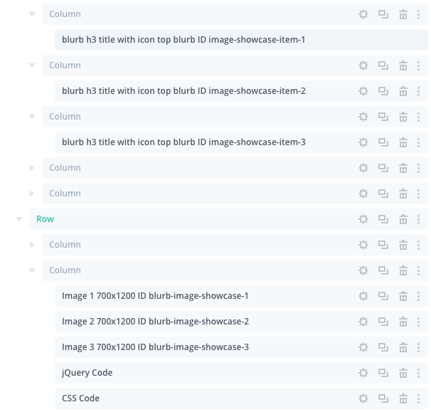
- The blurb ID of image-showcase-item-1 is therefore displaying the image module with ID blurb-image-showcase-1
- The blurb ID of image-showcase-item-2 is therefore displaying the image module with ID blurb-image-showcase-2
- The blurb ID of image-showcase-item-3 is therefore displaying the image module with ID blurb-image-showcase-3
To replace the images all you need to do is click on the settings icon: and then make your changes like you would any other image module.
All the jQuery Code and CSS Code is included in the the custom modules below the images. These are not visible on the front-end and should be edited with caution.
Most users simply tweak the blurb design and replace the images to make it suit their look and feel.
Interactive Section 4
This Interactive section displays and hides images depending on which blurb module is clicked.


Each blurb module can be customised along with the corresponding image.
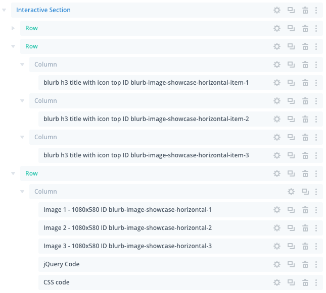
- The blurb ID of blurb-image-showcase-horizontal-item-1 is therefore displaying the image module with ID blurb-image-showcase-horizontal-1
- The blurb ID of blurb-image-showcase-horizontal-item-2 is therefore displaying the image module with ID blurb-image-showcase-horizontal-2
- The blurb ID of blurb-image-showcase-horizontal-item-3 is therefore displaying the image module with ID blurb-image-showcase-horizontal-3
To replace the images all you need to do is click on the settings icon:and then make your changes like you would any other image module.
All the jQuery Code and CSS Code is included in the the custom modules below the images. These are not visible on the front-end and should be edited with caution.
Most users simply tweak the blurb design and replace the images to make it suit their look and feel.
Interactive Section 5
This Interactive section displays and hides images depending on which blurb module is clicked. 

Each blurb module can be customised along with the corresponding image.
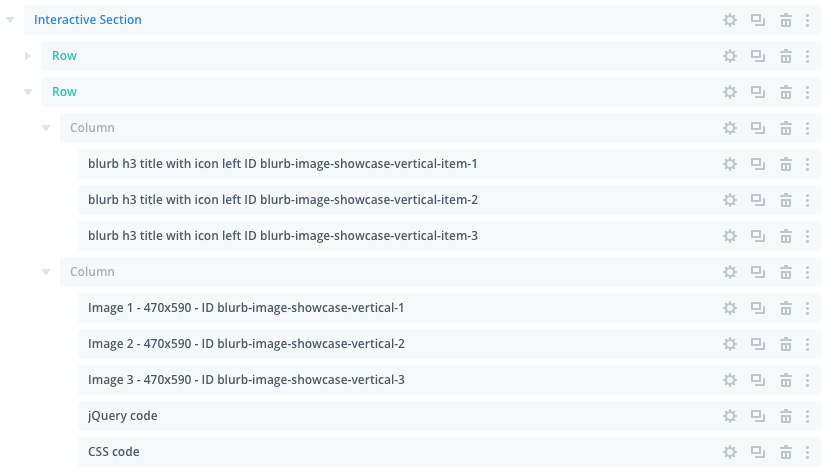
- The blurb ID of blurb-image-showcase-vertical-item-1 is therefore displaying the image module with ID blurb-image-showcase-vertical-1
- The blurb ID of blurb-image-showcase-vertical-item-2 is therefore displaying the image module with ID blurb-image-showcase-vertical-2
- The blurb ID of blurb-image-showcase-vertical-item-3 is therefore displaying the image module with ID blurb-image-showcase-vertical-3
To replace the images all you need to do is click on the settings icon:and then make your changes like you would any other image module.
All the jQuery Code and CSS Code is included in the the custom modules below the images. These are not visible on the front-end and should be edited with caution.
Most users simply tweak the blurb design and replace the images to make it suit their look and feel.
You can view more variations on the interactive sections page.
Interactive Section 6
This Interactive section displays and hides images depending on which blurb module is clicked.


Each blurb module can be customised along with the corresponding image. Here is the Layer view of this interactive section:
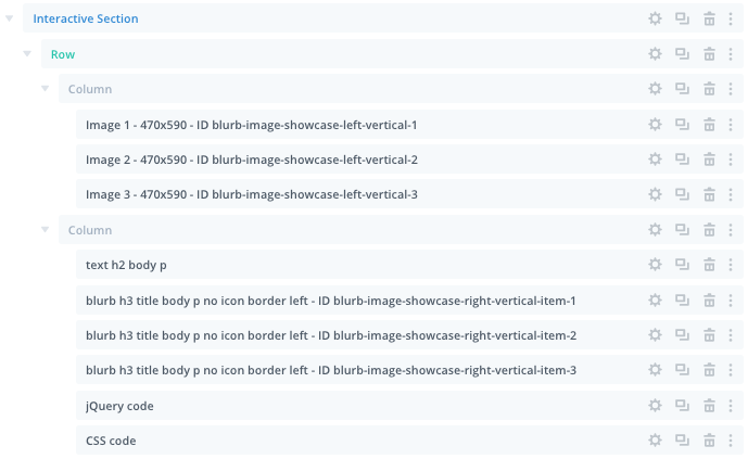
- The blurb ID of blurb-image-showcase-right-vertical-item-1 is therefore displaying the image module with ID blurb-image-showcase-left-vertical-1
- The blurb ID of blurb-image-showcase-right-vertical-item-2 is therefore displaying the image module with ID blurb-image-showcase-left-vertical-2
- The blurb ID of blurb-image-showcase-right-vertical-item-3 is therefore displaying the image module with ID blurb-image-showcase-left-vertical-3
To replace the images all you need to do is click on the settings icon:and then make your changes like you would any other image module.
All the jQuery Code and CSS Code is included in the the custom modules below the images. These are not visible on the front-end and should be edited with caution.
Most users simply tweak the blurb design and replace the images to make it suit their look and feel.
Interactive Section 7
Default "off" state.

Default "on" state:


This effect is achieved by settings two custom class names to two seperate rows:
section-1-switch
section-2-switch
The second row is set to display:none so that it is only displayed when the switch is in the "on" position.
jQuery is used to display and hide the relevant sections when the switcher input checkbox is checked or not.
Here is the Layer view of this interactive section:

The "Toggle Switch HTML Code" contains the html text before and after the toggle switch and includes the html for the checkbox input of the toggle switch:
 The "Toggle Switch CSS Code" Module" houses all of the Custom CSS to style the toggle switch and text above.
Line 135 of the "Toggle Switch CSS Code" controls which Row is initially hidden or in the "off" state. In this instance the Row with class .section-2-switch is set to display: none.
To edit the hidden row via the Visual Builder, all you need to do is comment out Line 135 of the "Toggle Switch CSS Code" module.
The default is set to display:none:
 Commenting out the display:none; like this allows us to edit the row in the visual builder:

And here's the Visual Builder with both rows now visible:
 You can now change any of the elements in the Row just like you would any other row. You can edit the Blurb Modules or customise the row however you wish.
When you're ready to make this live, remove your commented out class on 135 of the "Toggle Switch CSS Code" so that display:none is active again:
To update the actual text you'll need to edit the "Toggle Switch HTML Code" module.
 If you want to edit the colors and active classes you can refer to the various commented CSS properties in the "Toggle Switch CSS Code" module.
For example, let's say you want to change the color of the demo text "The current Way".
Opening up the "Toggle Switch CSS Code" module, you can edit the color hex code on line 33:

You can edit these styles as far you'd like to customise the look and feel of the switcher text and colors.
Interactive Sections 8 - 20
These interactive Sections allow you to toggle Row content.
Each blurb module can be customised along with the corresponding Row and all the modules within the row.
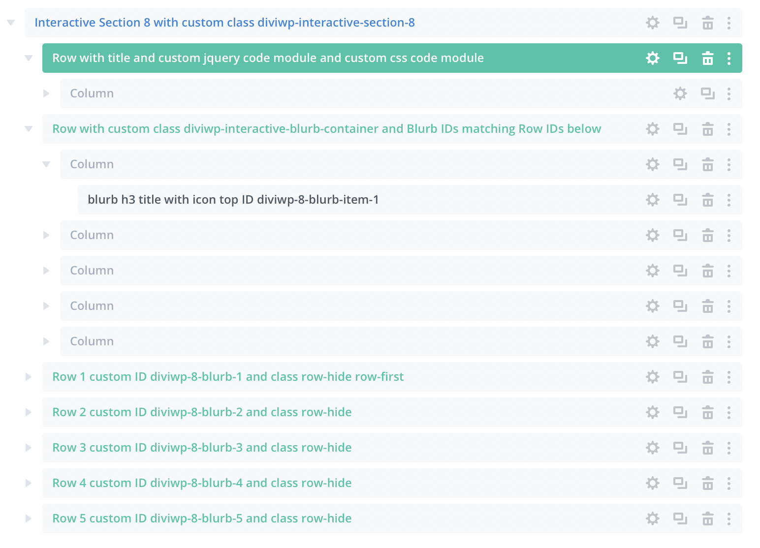 In the Layers View for Section 8 for example, you can see the first Blurb has an ID of "diviwp-8-blurb-item-1". Notice how Row 1 has an ID of "diviwp-8-blurb-1". This illustrates how each Blurb is associated with each Row.
In order to view the hidden Rows in the Visual Builder, you'll need to open up the Custom CSS included with each Section:
The screenshot below uses Interactive Section 8 as an example.

On line 9, all you'd need to do is comment out the display:none property for the row-hide class by either removing it or commenting it out like this:
/* display: none; */
You'll then be able to make all your changes within the Visual Builder to each Row.
Then when you're ready to publish, you can just remove your comment or add the property display: none; back in.
We've got more in-depth documentation for Section 8 - 20 coming soon. In the meantime, feel free to open a support ticket should you require any assistance.
You can move all CSS and jQuery into Divi's Theme Options or your child theme.
All you'd need to do is copy the Custom CSS classes and their properties and paste them into one of the options above.
Just remember to delete the opening and closing <style> tags or <script> tags if you're moving any custom JavaScript.