Newsletter Sections
Layout Demo URL: https://diviwp.com/ui/sections/newsletter-sections/
Newsletter Sections contain a combination of Text Modules with Gravity Forms Shortcodes as well as Divi's built-in Email Optin Module.
We've grouped the sections below starting with the Email Optin Sections.
Editing the demo content
Each DiviWP Section can be edited using the Visual Builder.
You can make your changes to various module settings, upload new images, change colors, toggle between the desktop, tablet and mobile views and publish your page to achieve the look in the demo.
In some sections outlined below, Custom CSS is necessary to achieve a desired affect or an optimal responsive user experience and where the Divi Builder was unable to do it with it's Module settings alone.
Why Custom CSS is used in Sections
Divi is an incredible builder and you can certainly do a ton of things with its built-in settings.
We're sure we'll see the introduction of even more new settings in time, but for now, we believe it does not (yet) have the ability to configure the necessary settings to create a particular interface design or effects.
So by including Custom CSS in a seperate Code Module or labeled within the Row, Column or Module, you can learn how we've used various CSS properties to achieve a desired effect.
How to view Custom CSS
When you are editing in the Visual Mode and building on the front-end of your website, Custom CSS Code Modules or Custom CSS configured within a Row, Column or Module is not visible.
Accessing the Layer View or Wireframe mode gives you access to your page and section structure, displaying all elements in an organized, nested hierarchy list that clearly showcases your page structure. Learn more about Layer View and Wireframe mode.
Email Optin Custom CSS in use in sections (scroll down for in-depth documentation)
- Newsletter Section 2 - Email Optin Module
- Newsletter Section 4 - Email Optin Module
- Newsletter Section 6 - Email Optin Module
- Newsletter Section 8 - Email Optin Module
- Newsletter Section 10 - Email Optin Module
- Newsletter Section 12 - Email Optin Module
- Newsletter Section 14 - Email Optin Module
- Newsletter Section 16 - Email Optin Module
Gravity Forms Custom CSS in use in sections (scroll down for in-depth documentation)
- Newsletter Section 1 - Custom CSS Code Module
- Newsletter Section 3 - Custom CSS Code Module
- Newsletter Section 5 - Custom CSS Code Module
- Newsletter Section 7 - Custom CSS Code Module
- Newsletter Section 9 - Custom CSS Code Module
- Newsletter Section 11 - Custom CSS Code Module
- Newsletter Section 13 - Custom CSS Code Module
- Newsletter Section 15 - Custom CSS Code Module
Related documentation:
- Can I edit Module labels?
- Can I modify Layouts or Sections?
- Custom CSS - How and Why It's Used in Sections
- How are admin labels used in Sections, Rows, Columns and Modules?
- What if I don't want to use any Custom CSS?
Support is always on hand
You can rest assured that support is always on-hand and we'll be able to guide you as far as possible should you require assistance with any custom CSS we have included in our layouts, templates or sections.
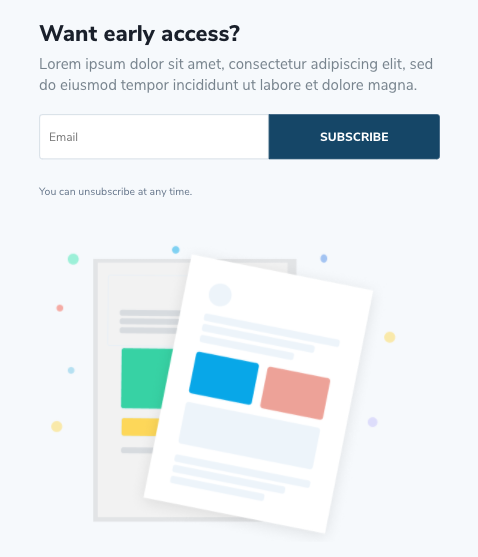
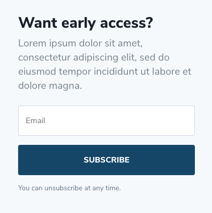
Newsletter Section 2, 4 and 6 - Email Optin Module

Accessing the Layer View or Wireframe mode gives you access to your page and section structure, displaying all elements in an organized, nested hierarchy list that clearly showcases your page structure. Learn more about Layer View and Wireframe mode.

In the layers view above, you can see the Custom CSS module which is targeting the Email Optin Module with a custom class of .diviwp-optin-form-white-input. (Custom Classes are applied in Module Settings → Advanced → CSS ID and Classes)
Note:
Newsletter Section 8 and 10 - Email Optin Module

In the layers view below, you can see the Custom CSS module which is targeting the Email Optin Module with a custom class of .diviwp-optin-form-gray-input.

This CSS enables the unique design of the Email Optin Module that is not possible to achieve using only the Email Optin Module settings.
The CSS enables the form to format beautifully across various responsive breakpoints:
Tablet view

Mobile view
Note:
Newsletter Sections 10 uses the same custom class name for the Email Optin Module as well as the same Custom CSS module.
Newsletter Section 12, 14 and 16 - Email Optin Modules


In the layers view, you can see the Custom CSS module which is targeting the Email Optin module with a custom class of .diviwp-optin-form-firstname-white-input.
 This CSS enables the optin module to format beautifully across various responsive breakpoints:
Desktop view
 Tablet view

Mobile view
Note:
Newsletter Sections 12, 14 and1 6 use the same custom class name for the Email Optin Module as well as the same Custom CSS modules.
Gravity Forms Documentation
Gravity Forms Sections 1,3,5, 7 and 9 - Custom CSS
 Desktop view
Tablet view
 Mobile view
Configuration
In order for your Gravity Forms to work with the correct custom CSS within each section, you'll need to identify which classnames to apply to each of your Gravity Forms.

The module labeled "Gravity Forms CSS Code for .diviwp-gf-newsletter-white-input" is describing the classname it is targeting.
In this instance, you would head to your Gravity Form individual form settings and add the custom class name diviwp-gf-newsletter-white-input and gf_simple_horizontal.
Here's an example of that:

The additional classname of gf_simple_horizontal are helper classes to achieve the side-by-side input-with-button design in the various sections.
You'll also need to add the Custom CSS Class gf_inline to the email field within your individual Gravity Form for Sections 1,3,5,7,9:

All of the CSS properties for these classes are within the Module labeled "Gravity Forms CSS Code for .diviwp-gf-newsletter-white-input"
You can edit the CSS and customise it to match your own look and feel.
Note:
- Gravity Forms Newsletter Sections 1, 3 and 4 use the same custom class name and custom CSS: .diviwp-gf-newsletter-white-input
- Gravity Forms Newsletter Sections 7 and 9 use a different custom class name and custom CSS: .diviwp-gf-newsletter-gray-input however the properties are identical besides the input field color.
Gravity Forms Sections 11,13 and 15 - Custom CSS

Desktop view
 Tablet view

Mobile view
These forms use an additional field for the first name input.
You'll need to include the settings in the screenshot below for your own Gravity Form for the first name field:

And the settings below for your email field:
 And note the classname in the form settings:

Just as the other Gravity Forms, all the CSS is housed in the Custom CSS Code module. We can view this via the layers view:

You can edit the CSS and customise it to match your own look and feel.
Note:
- Gravity Forms Newsletter Sections 11 and 15 use the same custom class name and custom CSS: .diviwp-gf-newsletter-firstname-white-input
- Gravity Forms Newsletter Section 13 uses a different custom class name and custom CSS: .diviwp-gf-newsletter-firstname-gray-input however the properties are identical besides the input field color.
Support is always on hand
You can rest assured that support is always on-hand and we'll be able to guide you as far as possible should you require assistance with any custom CSS we have included in our layouts, templates or sections.