Homepage Layout 4 Documentation
Layout Demo URL: https://diviwp.com/ui/page-layouts/home-pages/homepage-4/
This perfect starting point for your homepage or landing page.
It includes 12 versatile and beautifully designed sections you can mix and match to make your own.
Editing the demo content
Each DiviWP Layout can be edited using the Visual Builder.
You can make your changes to various module settings, upload new images, change colors, toggle between the desktop, tablet and mobile views and publish your page to achieve the look in the demo.
In some sections outlined below, Custom CSS is necessary to achieve a desired affect or an optimal responsive user experience and where the Divi Builder was unable to do it with it's Module settings alone.
Why Custom CSS is used in Sections
Divi is an incredible builder and you can certainly do a ton of things with its built-in settings.
We're sure we'll see the introduction of even more new settings in time, but for now, we believe it does not (yet) have the ability to configure the necessary settings to create a particular interface design or effects.
So by including Custom CSS in a seperate Code Module or labeled within the Row, Column or Module, you can learn how we've used various CSS properties to achieve a desired effect.
How to view Custom CSS
When you are editing in the Visual Mode and building on the front-end of your website, Custom CSS Code Modules or Custom CSS configured within a Row, Column or Module is not visible.
Accessing the Layer View or Wireframe mode gives you access to your page and section structure, displaying all elements in an organized, nested hierarchy list that clearly showcases your page structure. Learn more about Layer View and Wireframe mode.
Custom CSS in use in this Layout (scroll down for in-depth documentation)
- Hero Section
- CSS Code Module for Video Module
- Feature Section
- CSS Code Module for Email Optin Module
- Interactive Section
- CSS Code Module
- Javascript Code Module
- Newsletter Section
- CSS Code Module for Email Optin Module
Related documentation:
- Can I edit Module labels?
- Can I modify Layouts or Sections?
- Custom CSS - How and Why It's Used in Sections
- How are admin labels used in Sections, Rows, Columns and Modules?
- What if I don't want to use any Custom CSS?
Support is always on hand
You can rest assured that support is always on-hand and we'll be able to guide you as far as possible should you require assistance with any custom CSS we have included in our layouts, templates or sections.
Hero Section - Image Module

Accessing the Layer View or Wireframe mode gives you access to your page and section structure, displaying all elements in an organized, nested hierarchy list that clearly showcases your page structure. Learn more about Layer View and Wireframe mode.
Let's look at the above section via the Layer View below.

In this section, the code module contains CSS that is targeting the Image Module with a custom classname of .diviwp-image-10-portrait and applying CSS properties to maintain the image height 100% to it's parent column. (You can view the custom classes in in Module Settings → Advanced → CSS ID and Classes)
The CSS Code module also contains CSS to that will maintain the image aspect ratio to 16:9 tablet and mobile breakpoints. This enables images to have a smaller height while cropping the image automatically without distorting it.
The reason this technique is used is to reduce the overall height of the image at tablet and mobile breakpoints.
Notice how the section below looks correct and easy to digest.

Tablet view
If we didn't use the aspect ratio CSS trick, the image would take up a huge portion of the screen unnecessarily and wouldn't feel as polished. Here's an example below:
 Tablet view
Notice how much vertical space the image takes up unnecessarily - that's crazy huge! I had to zoom out just to make sense of it!
A few alternative solutions you might be interested in or want to try yourself:
- Upload different images for Desktop, Tablet and Mobile views in the builder.
We don't like this solution because it triples the amount of work you're doing for yourself, having to create the images and then upload them individually for each change.
- Duplicate the row and make the "Desktop" row invisible and the "Tablet" row visible.
We don't like how this solution doubles your time to make a change. Any change you make to the first row, you'll have to remember to make for the second. We like striving for a "single source of truth" as far as possible.
- Use the image as a background image of it's parent column and leave the column empty
The card design in the template is optimised for usability so the ability to click on the image is important. You can't click on background images.
You might say that you can set the column to be clickable which would "mimic" the same effect as having a clickable image. This is true and is an alternative option, however, setting the background image in the column is not an intuitive editing experience for users who might be updating the layout on a regular basis. There are also SEO sacrifices such as the background image not being indexed for Google Image.
Feature Section - Email Optin Module

In the layers view below, you can see the Custom CSS module which is targeting the Email Optin Module with a custom class of .diviwp-optin-form-gray-input.

This CSS enables the unique design of the Email Optin Module that is not possible to achieve using only the Email Optin Module settings. The CSS enables the form to format beautifully across various responsive breakpoints:

Tablet view

Mobile view
Interactive Section
This Interactive section displays and hides images depending on which blurb module is clicked.

Each blurb module can be customised along with the corresponding image. Interactive Sections like the one in this layout (and including all the interactive sections) above rely on jQuery to hide or show elements on-click.
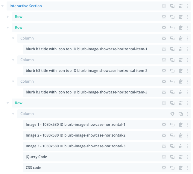
- The blurb ID of blurb-image-showcase-horizontal-item-1 is therefore displaying the image module with ID blurb-image-showcase-horizontal-1
- The blurb ID of blurb-image-showcase-horizontal-item-2 is therefore displaying the image module with ID blurb-image-showcase-horizontal-2
- The blurb ID of blurb-image-showcase-horizontal-item-3 is therefore displaying the image module with ID blurb-image-showcase-horizontal-3
To replace the images all you need to do is click on the settings icon: and then make your changes like you would any other image module.
All the jQuery Code and CSS Code is included in the the custom modules below the images. These are not visible on the front-end and should be edited with caution.
Most users simply tweak the blurb design and replace the images to make it suit their look and feel.
You can view more variations on the interactive sections page.
Newsletter Section - Email Optin Module

In the layers view below, you can see the Custom CSS module which is targeting the Email Optin Module with a custom class of .diviwp-optin-form-firstname-gray-input

This CSS enables the unique design of the Email Optin Module that is not possible to achieve using only the Email Optin Module settings.
The CSS enables the form to format beautifully across various responsive breakpoints:

Tablet view

Mobile view