Homepage Layout 3 Documentation
Layout Demo URL: https://diviwp.com/ui/page-layouts/home-pages/homepage-3/
This perfect starting point for your homepage or landing page.
It includes 12 versatile and beautifully designed sections you can mix and match to make your own.
Editing the demo content
Each DiviWP Layout can be edited using the Visual Builder.
You can make your changes to various module settings, upload new images, change colors, toggle between the desktop, tablet and mobile views and publish your page to achieve the look in the demo.
In some sections outlined below, Custom CSS is necessary to achieve a desired affect or an optimal responsive user experience and where the Divi Builder was unable to do it with it's Module settings alone.
Why Custom CSS is used in Sections
Divi is an incredible builder and you can certainly do a ton of things with its built-in settings.
We're sure we'll see the introduction of even more new settings in time, but for now, we believe it does not (yet) have the ability to configure the necessary settings to create a particular interface design or effects.
So by including Custom CSS in a seperate Code Module or labeled within the Row, Column or Module, you can learn how we've used various CSS properties to achieve a desired effect.
How to view Custom CSS
When you are editing in the Visual Mode and building on the front-end of your website, Custom CSS Code Modules or Custom CSS configured within a Row, Column or Module is not visible.
Accessing the Layer View or Wireframe mode gives you access to your page and section structure, displaying all elements in an organized, nested hierarchy list that clearly showcases your page structure. Learn more about Layer View and Wireframe mode.
Custom CSS in use in this Layout (scroll down for in-depth documentation)
- Hero Section
- CSS Code Module for Video Module
- Interactive Section
- CSS Code Module
- Javascript Code Module
- Newsletter Section
- CSS Code Module for Optin Form Module
Related documentation:
- Can I edit Module labels?
- Can I modify Layouts or Sections?
- Custom CSS - How and Why It's Used in Sections
- How are admin labels used in Sections, Rows, Columns and Modules?
- What if I don't want to use any Custom CSS?
Support is always on hand
You can rest assured that support is always on-hand and we'll be able to guide you as far as possible should you require assistance with any custom CSS we have included in our layouts, templates or sections.
Hero Section

Accessing the Layer View or Wireframe mode gives you access to your page and section structure, displaying all elements in an organized, nested hierarchy list that clearly showcases your page structure. Learn more about Layer View and Wireframe mode.
Let's look at the above section via the Layer View below.

For example, the Video Module labeled "Video .diviwp-video-height-100" is describing:
- A Video Module
- With a custom class name diviwp-video-height-100 (You can view this in Module Settings → Advanced → CSS ID and Classes)
Below the Video Module you'll a see Code Module labeled "CSS Code for .diviwp-video-height-100 to make video 100% height for screen sizes 980px - 1310px".
The Code Module admin label is describing what the CSS properties within it's module are targeting and describes what it is used for.
In this case, the code module contains CSS that is targeting the classname .diviwp-video-height-100 and applying CSS properties to maintain the video height 100% to it's parent column, thereby preserving the "card" design of the row at various responsive breakpoints.
Here's an example of this in action at 1055px screen width:

Notice how the video takes up 100% of the "card" row while maintaining it's proportions.
If we removed the CSS Code module, here's what the row would look like at 1055px screen width:
 Without the custom CSS, the video does not scale vertically proportionately. This doesn't make the design feel as "polished".
Interactive Section
This Interactive section displays and hides images depending on which blurb module is clicked. 
Each blurb module can be customised along with the corresponding image. Interactive Sections like the one in this layout (and including all the interactive sections) above rely on jQuery to hide or show elements on-click.
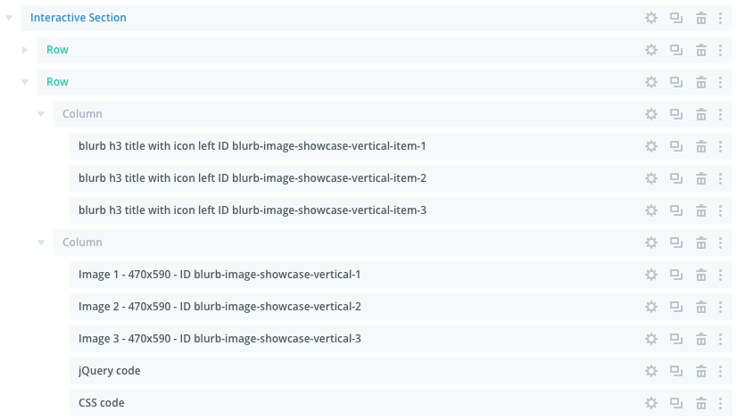
- The blurb ID of blurb-image-showcase-vertical-item-1 is therefore displaying the image module with ID blurb-image-showcase-vertical-1
- The blurb ID of blurb-image-showcase-vertical-item-2 is therefore displaying the image module with ID blurb-image-showcase-vertical-2
- The blurb ID of blurb-image-showcase-vertical-item-3 is therefore displaying the image module with ID blurb-image-showcase-vertical-3
To replace the images all you need to do is click on the settings icon: and then make your changes like you would any other image module.
All the jQuery Code and CSS Code is included in the the custom modules below the images. These are not visible on the front-end and should be edited with caution.
Most users simply tweak the blurb design and replace the images to make it suit their look and feel.
You can view more variations on the interactive sections page.
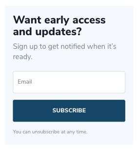
Newsletter Section - Email Optin Module

In the layers view below, you can see the Custom CSS module which is targeting the Email Optin Module with a custom class of .diviwp-optin-form-white-input

This CSS enables the unique design of the Email Optin Module that is not possible to achieve using only the Email Optin Module settings.
The CSS enables the form to format beautifully across various responsive breakpoints.

Tablet view