Landing Page Layout 10
Layout Demo URL: https://diviwp.com/ui/page-layouts/landing-pages/sales-page-templates/landing-10/
Please review the Importing Layouts documentation to import this layout into your website.
Overview
This layout is positioned within the Sales Page Template category and has been designed to facilitate a single desired action.
Desired Action → Purchase a product, software as a service (SaaS), an ebook, an online course, premium newsletter subscriptions, tickets, services and more.
This layouts includes 14 versatile and responsive Sections that fulfils a specific task, be that establishing credibility via testimonials to outlining the pain and highlighting the benefits. As a user scans down the page, specific call-to-actions (CTA) Sections prompt the user to perform the desired action.
Editing the demo content
Each DiviWP Layout can be edited using the Visual Builder.
You can make your changes to various module settings, upload new images, change colors, toggle between the desktop, tablet and mobile views and publish your page to achieve the look in the demo.
In some sections outlined below, Custom CSS is necessary to achieve a desired affect or an optimal responsive user experience and where the Divi Builder was unable to do it with its Module settings alone.
Why Custom CSS is used in Sections
Divi is an incredible builder and you can certainly do a ton of things with its built-in settings.
We're sure we'll see the introduction of even more new settings in time, but for now, we believe it does not (yet) have the ability to configure the necessary settings to create a particular interface design or effects.
So by including Custom CSS in a seperate Code Module or labeled within the Row, Column or Module, you can learn how we've used various CSS properties to achieve a desired effect.
How to view Custom CSS
When you are editing in the Visual Mode and building on the front-end of your website, Custom CSS Code Modules or Custom CSS configured within a Row, Column or Module is not visible.
Accessing the Layer View or Wireframe mode gives you access to your page and section structure, displaying all elements in an organized, nested hierarchy list that clearly showcases your page structure. Learn more about Layer View and Wireframe mode.
Custom CSS in use in this Layout (scroll down for in-depth documentation)
- Hero Section
- CSS Code Module
- Blurb Section
- CSS Code Module
- Card Section (The Pain)
- CSS Code Module
- Card Sections (How it works)
- CSS Code Module
Related documentation:
- Can I edit Module labels?
- Can I modify Layouts or Sections?
- Custom CSS - How and Why It's Used in Sections
- How are admin labels used in Sections, Rows, Columns and Modules?
- What if I don't want to use any Custom CSS?
Support is always on hand
You can rest assured that support is always on-hand and we'll be able to guide you as far as possible should you require assistance with any custom CSS we have included in our layouts, templates or sections.
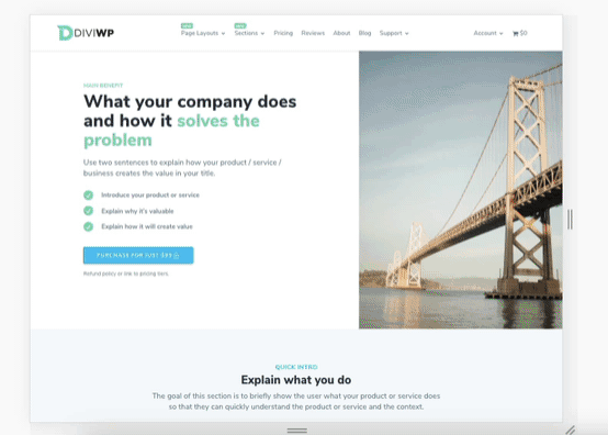
Hero Section

Accessing the Layer View or Wireframe mode gives you access to your page and section structure, displaying all elements in an organized, nested hierarchy list that clearly showcases your page structure. Learn more about Layer View and Wireframe mode.
Let's look at the above section via the Layer View below.

Firstly, notice how the second Column has the following label: Column .diviwp-col-flex
This means the Column has a custom class called diviwp-col-flex which is set via the Column Settings → Advanced → CSS ID and Classes:

Secondly, notice how the Image module has the following label: Image .diviwp-image-10-portrait 550x755
This means the Image module has a custom class of diviwp-image-10-portrait set via Image Module Settings → Advanced → CSS ID and Classes. The 500x755 is an example image resolution you could use to replace the image.
Now that we've established the class names for the Column and the Image, we can review the Code Module: CSS Code for diviwp-image-10-portrait to maintain image 100% height and crop aspect ratio 16:9 for tablet and mobile
This means the Custom Code module has CSS properties which are targeting the class diviwp-image-height-10-portrait, set for the Image Module as outlined above, as well as a brief description of what this does.
In this instance, the code in the module is making the Image Module stretch proportionately to fill 100% of the vertical space of the column it is positioned in.
- This does not produce a new image file, it merely uses an aspect-ratio friendly CSS trick for tablet and mobile breakpoints.
- The code does not degrade the image in anyway and the original quality is maintained.
- This may result in some cropping of your image if you upload square images as per the live demo
The reason this technique is used is to reduce the overall height of the image at tablet and mobile breakpoints.
If we didn't use the aspect ratio CSS trick, the image would take up a huge portion of the screen unnecessarily and wouldn't feel as polished. Here's an example below:

Notice how much vertical space the image takes up unnecessarily - that's crazy huge! I had to zoom out just to make sense of it!
A few alternative solutions you might be interested in or want to try yourself:
- Upload different images for Desktop, Tablet and Mobile views in the builder.
We don't like this solution because it triples the amount of work you're doing for yourself, having to create the images and then upload them individually for each change.
- Duplicate the row and make the "Desktop" row invisible and the "Tablet" row visible.
We don't like how this solution doubles your time to make a change. Any change you make to the first row, you'll have to remember to make for the second. We like striving for a "single source of truth" as far as possible.
- Use the image as a background image of it's parent column and leave the column empty
The card design in the template is optimised for usability so the ability to click on the image is important. You can't click on background images.
You might say that you can set the column to be clickable which would "mimic" the same effect as having a clickable image. This is true and is an alternative option, however, setting the background image in the column is not an intuitive editing experience for users who might be updating the layout on a regular basis. There are also SEO sacrifices such as the background image not being indexed for Google Image.
Blurb Section

Let's look at the above section via the Layer View below:

The Image module has the following label: Image .diviwp-image-16-9 640x360
This means the Image module has a custom class of diviwp-image-16-9 set via Image Module Settings → Advanced → CSS ID and Classes. The 640x360 is an example image resolution you could use to replace the image.
The Code Module: "CSS Code for .diviwp-image-16-9 to crop image module aspect ratio to 16:9" has CSS properties which are targeting the class diviwp-image-16-9 set for the Image Module as outlined above, as well as a brief description of what this does.
The code includes properties to maintain the image's proportional height by cropping it to a perspective that maintains an aspect ratio of 16:9:
- This does not produce a new image file, it merely uses an aspect-ratio friendly CSS trick for tablet and mobile breakpoints.
- The code does not degrade the image in anyway and the original quality is maintained.
- This may result in some cropping of your image if you upload square images as per the live demo
Here's a gif illustrating the section

Card Section

Let's look at the above section via the Layers View below.

Firstly, notice how the second Column has the following label: Column .diviwp-col-flex
This means the Column has a custom class called diviwp-col-flex which is set via the Column Settings → Advanced → CSS ID and Classes:
Secondly, notice how the Image module has the following label: Image .diviwp-listing-height-100 500x500
This means the Image module has a custom class of diviwp-listing-height-100 set via Image Module Settings → Advanced → CSS ID and Classes. The 500x500 is an example image resolution you could use to replace the image.

Now that we've established the class names for the Column and the Image, we can review the Code Module: CSS Code for diviwp-listing-height-100 to maintain image 100% height to parent column
This means the Custom Code module has CSS properties which are targeting the class diviwp-listing-height-100, set for the Image Module as outlined above, as well as a brief description of what this does.
In this instance, the code in the module is making the Image Module stretch proportionately to fill 100% of the vertical space of the column it is positioned in.
- This does not produce a new image file, it merely uses an aspect-ratio friendly CSS trick for tablet and mobile breakpoints.
- The code does not degrade the image in anyway and the original quality is maintained.
- This may result in some cropping of your image if you upload square images as per the live demo
This means the "Card" interface is maintained at various browser sizes. Here is an example of this when testing the responsiveness of the Section.

Card Section

Let's look at the above section via the Layer View below:

You can see how the image label references the same class name as the other card section: diviwp-listing-height-100.
This means the image is utilising the aspect ratio CSS trick outlined above:

This is why Custom CSS is only used in places where it is necessary to achieve a desired affect or an optimal responsive user experience and where the Divi Builder was unable to do it alone.
Note: You can review more DiviWP Card Sections should you want to substitute this version for another.
Can I move the CSS in the Custom CSS Code Module into Divi's Theme Options or my own Child Theme?
Of course!
All you'd need to do is copy the contents of the custom css code module and paste them into one of the options:
- Divi's Theme Options: Admin Dashboard → Divi → Theme Options (scroll down to Custom CSS box)
- Your Child Theme: via editing your styles.css file
Just remember to delete the opening and closing <style> tags or <script> tags if you're moving any custom javascript.
Support is always on hand
You can rest assured that support is always on-hand and we'll be able to guide you as far as possible should you require assistance with any custom CSS we have included in our layouts, templates or sections.