Header Sections Detailed Overview
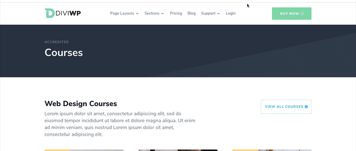
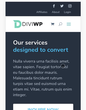
Headers are the top sections of pages. They represent the identity of a website primarily through the use of a linked logo to the Home page as well as navigational menus which direct users to different pages or sections.
These Header Sections use the built-in Menu Module for logo and menu functionality along with combinations of Blurb Modules, Button Modules and Social Follow Modules.
Custom Code Modules are including in each Header Section for the jQuery and CSS necessary to implement these designs.
Setting up your Page or Theme Builder Template for Testing
You'll first need to create a new test page and Theme Builder Template to apply your chosen Header Section of choice.
- Create a new page and give it a title, something like Header 1 will be fine.
- Publish a new layout or add a few dummy Sections to fill the page with content. Click Update.
- Now let's create a new Theme Builder Template by going to WordPress Admin → Divi → Theme Builder
- Click "Create Template" and then hover of the "Specific Pages" checkbox and then select your new page:

Now click "Add Custom Header" and then "Build Custom Header"
You can then click "Build From Scratch" and you're nearly set!
All you have to do now is drag-and-drop your header JSON file or use the Portability button to import your header:

You can read more about importing layouts and sections here
Import via the Portability System
If you're not comfortable dragging and dropping the JSON file into your template, then you can import files directly into your Template or Page via the Divi Builder.
If you're editing on the front-end then clicking on up and down arrow will open the Portability options.

If you're editing on the back-end then clicking on up and down arrow will open the Portability options.

You will then see the following settings modal:

Choose your file, in the image above we're using a homepage 1 example JSON file. You can optionally select "Replace existing content" if you want to remove any of your sections you've already designed. If you do not check this option then the layout will load beneath your last section.
You can optionally select "Download backup before importing". You do not need to select "Apply Layout's Defaults To This Website".
Finally, clicking on "Import Divi Builder Layout" will import your layout to your Theme Builder Template or Page.
When the import is finished, the page will reload and you can start to make your changes!

Accessing the Layer View or Wireframe mode gives you access to your section structure, displaying all elements in an organized, nested hierarchy list that clearly showcases the header structure. Learn more about Layer View and Wireframe mode.

Module Naming Conventions
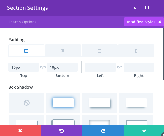
The Section Admin Label describes the header number and the custom class name that is set via
Section Settings → Advanced → CSS ID and Classes
In this example, the class name is set to diviwp-header-1
The admin label for the Custom CSS Code module refers to the class diviwp-header-1 meaning it is targeting that classname only. If your section had a different classname applied then the code within the CSS and jQuery Code Modules would not work.
This is important because you can experiment with these headers without worrying that you're going to break your existing header!
You're always in control and can easily turn on or off the CSS or jQuery Code Modules or copy it into your child theme or Divi Theme Options. More on that below!
Editing and Customizing
When you're editing the Menu Module via the Visual Builder, you can select your existing menu. Here I've selected a demo Menu I've setup:

Setting up your menus
You can use your existing menus you've setup via your
WordPress dashboard → Appearance → Menus
or you can create your own new menu.
Here's an example of how I've setup the following demo menu:

Notice how I've added a nested hierarchy.
DiviWP Headers support nested hierarchies on desktop and via a grouped toggle button on mobile - more on that further down below!
Back to editing the Menu Module:
You can also swap out the default DiviWP logo. The demo headers all include DiviWP's small 147x49 transparent PNG logo.
Logos
Each DiviWP Header uses a transparent PNG logo. Transparent PNG logos don't degrade well on mobile devices and can sometimes look pixelated.
It is highly recommended to use an SVG logo as it will scale up and down gracefully without any pixelation or distortion. If you do want to use SVG then make sure you've got the following plugin installed:
https://wordpress.org/plugins/svg-support/
If you only have PNG or JPG logos then it's best to experiment with larger resolution logo sizes for mobile/tablet devices or adjusting the max-width and max-height settings with the Menu Module.

You can also selectively toggle the shopping cart icon and show search icons:

Menu Alignment
As of Divi 4.6, the Menu Module does not (yet) include "Right Aligned" in it's Style drop-down:
 The solution to this is to keep the default "Left Aligned" value in the style drop-down above and navigate to the
Settings → Design → Menu Text →Text Alignment setting:

Selecting the " Right Aligned" option will move your menu to the right of the width of the column or row width in which it is positioned.
Changing Colors
The most efficient way to change colors is via the "Modified Styles" filter.
To filter by Modified Styles, click the "+ Filter" button and then select "Modified Styles".

This will bring up all the modified font, color, size etc settings for you to edit and experiment with.

To edit the line above the drop-down menu you can edit the
Settings → Design → Dropdown Menu → Dropdown Menu Line Color setting.
I've set the default to green as per the screenshot below:

The small caret triangle is added via custom CSS which is included in the Custom CSS Code Module.
If you want to experiment with removing the top line but keeping the caret, you'll need to put on your CSS Hat. Don't worry, it's fun and you might learn a thing or two along the way!
Back to the tutorial
Remove the top line but keep the caret triangle
Clicking on the settings of the "Custom CSS Code for diviwp-header-1", scroll down until you find the property
".diviwp-header-1 .et_pb_menu .nav li ul"

Remove the /* and */ comments so that it is active like the screenshot below:

Hit Save then open your page in a new tab, refresh. Here's what that looks like on the front-end:
 Now you could go back to your
Settings → Design → Dropdown Menu → Dropdown Menu Line Color setting
and it will only update the caret triangle. You could change the color to black for example and only the caret triangle will update.
To remove the caret triangle icon, you can either set the color to your menu background color in the Divi Builder via
Settings → Design → Dropdown Menu → Dropdown Menu Line Color or you can edit the CSS:
".diviwp-header-1 .nav li ul.sub-menu:before"
Commenting out the original properties and adding display:none; like the below screenshot.

The Mobile Menu
To change the color of the Hamburger menu go to
Settings → Design → Icons → Hamburger Menu Icon Color.
All Headers, with the exception of Header 4, use the default fade-in mobile menu transition when the hamburger is touched/clicked:

In addition to the fade-in transition, all headers with the exception of Header 4, automatically collapse submenus via a toggle button while keeping the parent item clickable and linked
In this visual representation, the Page Layouts link is still linked to the /page-layouts/ page while the green area toggles the sub-menu.

Here it is in action:


An alternative solution is available which removes the parent link to make the entire parent row toggle it's submenu.

Header 4 uses this option.
Opening a support ticket will allow me to share the link to the slightly tweaked jQuery code that enabled the parent item to be unclickable.
You can rest assured that support is always on-hand and we'll be able to guide you as far as possible should you require assistance.
Let's continue editing.
Edit the circular toggle on the mobile menus
You can edit the color of down and up arrows via the
Settings → Design → Dropdown Menu → Dropdown Menu Line Color
and you can edit the circle via the custom CSS module:

Within the Custom CSS code module you also have access to the following properties to experiment with.
	/* MENU CSS EDITS */

	.diviwp-header-6 li ul.sub-menu li {

	/* for dark background */
	border-bottom: 1px solid #353535;

	}

	.diviwp-header-6 ul.sub-menu a:hover {

	/* for dark background */
	background-color: #333;

	}

	.diviwp-header-6 .et_mobile_menu li a {

	/* for dark background */
	border-bottom: 1px solid #333;

	}
If you want to experiment with a dark mode for the sub-menu, you could use Header 6 as a starting point:

PLEASE NOTE: Currently, the Visual Builder does not display the grouped submenus and the toggle. You can get around this for now by making changes to your Custom CSS Module, saving and updating and then refreshing the page in a new tab.
Default Mega Menu Support
All Headers include Mega-Menu support on Desktop. Refer to Header 2 for an example.
Follow this tutorial for setting up your Mega Menu: https://www.elegantthemes.com/documentation/divi/mega-menus/
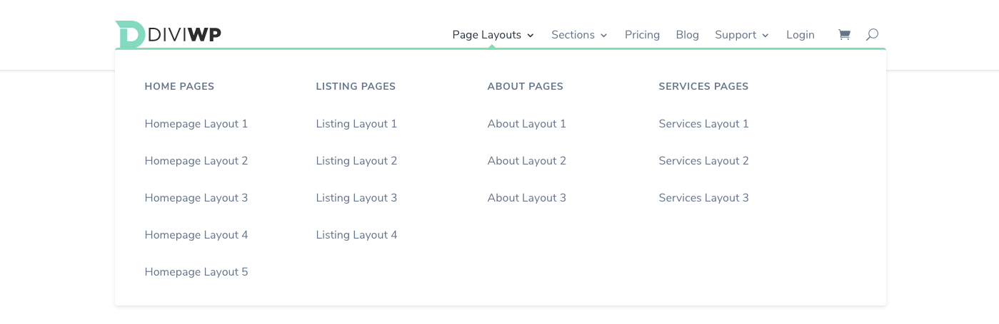
2 and 3 column Mega Menu drop-down options
Header 13 includes a beautiful 2-column mega-menu design and an optional fullwidth menu item button:

While Header 14 includes a 3 column design and an optional fullwidth menu item button::

Setting up 2 column mega menus
In order to create the 2 column mega menus as per the demo example above, you'll need to setup your menus via the:
WordPress admin dashboard → Appearance → Menus
You'll need to create a nested hierarchy as per the example menu setup below:

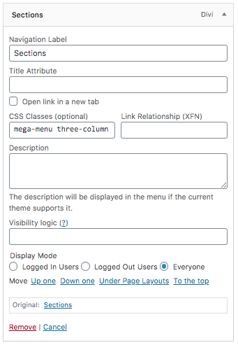
As we're using "Sections" as the parent menu item, we need to set a custom CSS class for the menu item.
Your parent menu item needs to have a custom class set to "mega-menu two-column" as per the screenshot below:
The Col 1 and Col 2 Menu items are not displayed in the menu and are used to create the column structure.
You can optionally display these menu items in your menu by changing display:none to display:block on line 279 of the Custom CSS module included in the section.
They will also need to have custom classes set as per the below example:
Col 1 will need to have "diviwp-menu-col-1" set:

Col 2 will need to have "diviwp-menu-col-2" set:

Finally, if you would like to keep the included styling for the last menu item button styles then you'll need to include the class "fullwidth" as per the example:

The CSS for the fullwidth button styles can be found in the Custom CSS module included with the section. Scroll down to line 319 and adjust to your liking:

You can of course choose to apply your own classname and style it however you wish or remove that menu item completely.
Setting up 3 column mega menus
In order to create the 3 column mega menus as per the demo example above, you'll need to setup your menus via the:
WordPress admin dashboard → Appearance → Menus
You'll need to create a nested hierarchy as per the example menu setup below:

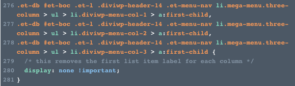

Col 2 will need to have "diviwp-menu-col-2" set,
Col 3 will need to have "diviwp-menu-col-3" set
Finally, if you would like to keep the included styling for the last menu item button styles then you'll need to include the class "fullwidth" as per the example:
The CSS for the fullwidth button styles can be found in the Custom CSS module included with the section. Scroll down to line 319 and adjust to your liking:

You can of course choose to apply your own classname and style it however you wish or remove that menu item completely.
Positioning the caret triangle for your 2 column or 3 column mega menu:
Depending on which parent menu item you're going to use for your 2 or 3 column mega menu, you'll need to adjust the positioning accordingly.
You can do this by opening up the Custom CSS module and then playing around with the percentage value on line 308 to position the caret how you'd like it:

Dealing with uneven menu items in 2 or 3 column mega menus
2 and 3 column mega menu styles work best when there are even number of menu items for each column.
If you have an uneven menu items for each column, then the last menu item won't have a border bottom and will look inconsistent with the design.
Here's an example, notice how the "Newsletter Sections" menu item doesn't have a border bottom and therefore looks a bit out of place and:

You can get resolve this by editing the Custom CSS module included in the section and editing the border-bottom on line 300:

Here's an example of the same menu with the border-bottom set to 1px solid #ececec:

Split Menu and Custom CSS Button
With the use of Flexbox we can split our menu to enable right-aligned action items to be positioned away from informational navigation.
In this example, we've set a custom class name for the Support Menu item which means all menu items from Support will be aligned to the right.
 You can decide which Menu items should be grouped to the right by adding a custom class to the menu item in
WordPress admin dashboard → Appearance → Menus
Expand the menu item and then in the "CSS Class (Optional)" field, ass the class
diviwp-menu-right-align
Here's an example:

Anything to the right of the menu item will then be positioned on the far right of the page while the menu will be positioned in the center.
The "Buy Now" button in the above example is also included in the Custom CSS code module and is fully editable by adding the class "diviwp-menu-button" to your menu item like the image below:

To edit this class, scroll to the following section in the Custom CSS code module:
/***** DIVIWP MENU BUTTON *****/

You can update the values to use your own background-colors and text colors.
Rows above Menus (Header 9 - 20)

These sections include rows that use a combination of Blurbs, Menus, Social Follow and Button Modules.
Because the default width has been maintained for the Row with the Menu Module (1080px), the top Row column uses hardcoded max-width and width settings to line up correctly with the Menu Row.
This technique enables the row to have a customizable fullwidth background color while still being positioned within one main Header Section. This is important for Sticky or Fixed options.
If you would like to use a fullwidth menu row then you can simply edit the the Custom CSS property to match your width values or you can remove the max-width and width setting and experiment with your own designs.
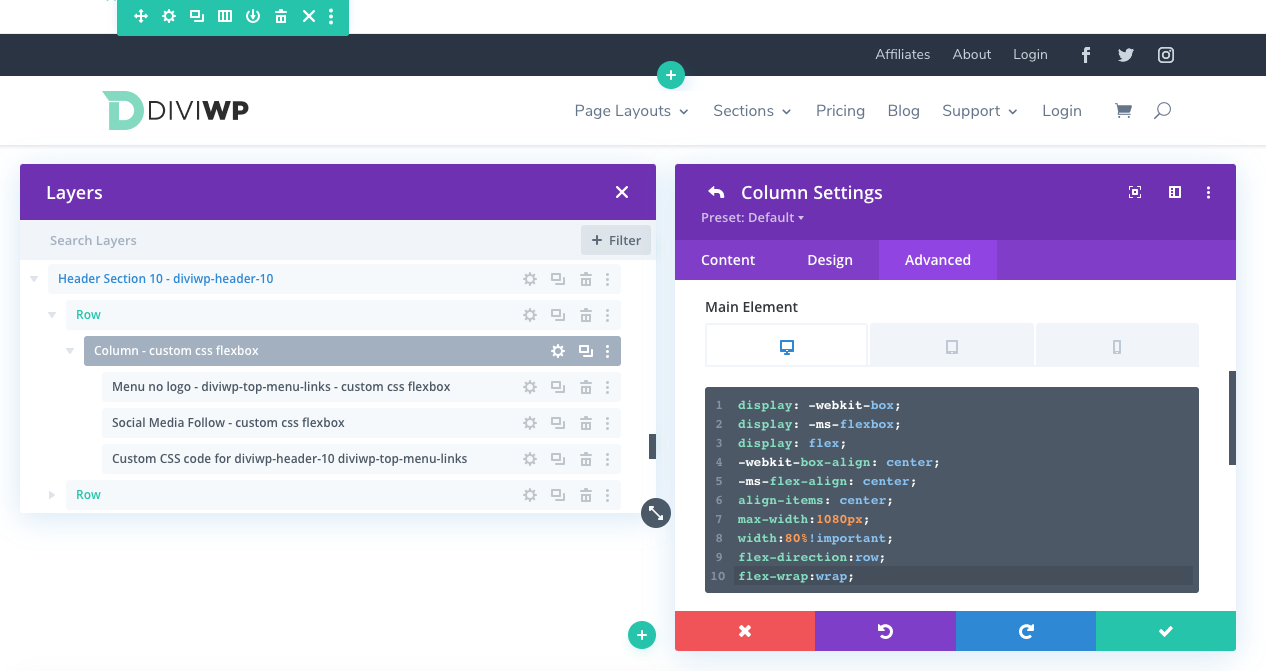
In the above screenshot, you can see how the max-width is set to 1080px and the width to 80% along with Flexbox properties to align the modules within it's column.
You can also see how each Modules's Admin label references - custom css Flexbox. This indicates the module has Divi's built-in Custom CSS option via the
Settings → Advanced → Custom CSS
You can experiment with or remove those values or you can even remove the row entirely. Add your existing custom designed to the Section.
I'm working on a juicy resource for using Flexbox with Divi which will be referenced soon!
Sticky and Fixed Positioning Compatibility
Your download folder will include a Sticky option for each Header.
When the stick-to-top feature is checked on and activated , the Section padding reduces down to 0px to "shrink" it.
On mobile, the mobile menu handles long nested submenu easily. This is achieved by custom jQuery code to calculate and set the mobile menu height.
Notice how you scroll within the menu's fixed height while scrolling:
You can experiment with your own sticky options and settings by clicking the Pin Icon and modifying the values.
Copying or Moving CSS / jQuery
You can move all Custom CSS and jQuery Code into Divi's Theme Options or your child theme.
Custom CSS can be copied and pasted into Divi → Theme Options → Custom CSS
- Remember to delete the opening and closing <style> tags
Custom jQuery can be copied and pasted into Divi → Theme Options → Integration → Add code to the <head> of your blog
- Remember to include the opening and closing <script> tags
Updates and versioning
When Custom CSS or jQuery needs to be updated, a new version will be released with the updated Header Section and Custom Code modules which you could then cut and paste into your existing code modules. This assumes you will keep the default class naming system.
One of our priorities is to work on an easy versioning process to help you understand when updates takes place. Something like a diff viewer might be useful or a gist repo. More on that as soon as we've got something solid!
Support is always on hand
You can rest assured that support is always on-hand and we'll be able to guide you as far as possible should you require assistance.
Importing Files from Your Divi Marketplace Download

Clicking the "Download Product" button after your purchase will download a product.zip file. Unzip the folder and you will see these files:

The main product file is titled "DiviWP All Headers Page Import.json". This will import ALL of the headers as per the demo URL: https://diviwp.com/ui/theme-builder/headers/all-headers/
You can read more about how importing this file into a page further down below.
To access the Supplementary files which includes all the individual JSON files, you will need to login to your Elegant Themes account and then scroll down to your Marketplace Downloads.
In the DiviWP Header Sections product you will see a purple button titled "Supplementary Files"

Clicking the Supplementary Files will download a "Supplementary.zip" file. Unzip the folder and you will see the folder is titled DiviWP Header Sections JSON files:

In the above screenshot you can see how each folder has both the normal header version and the sticky version.